Why a School for the Blind Went Back to Touch
What Kansas State School for the Blind, our first US school, taught us about designing a school that students can read
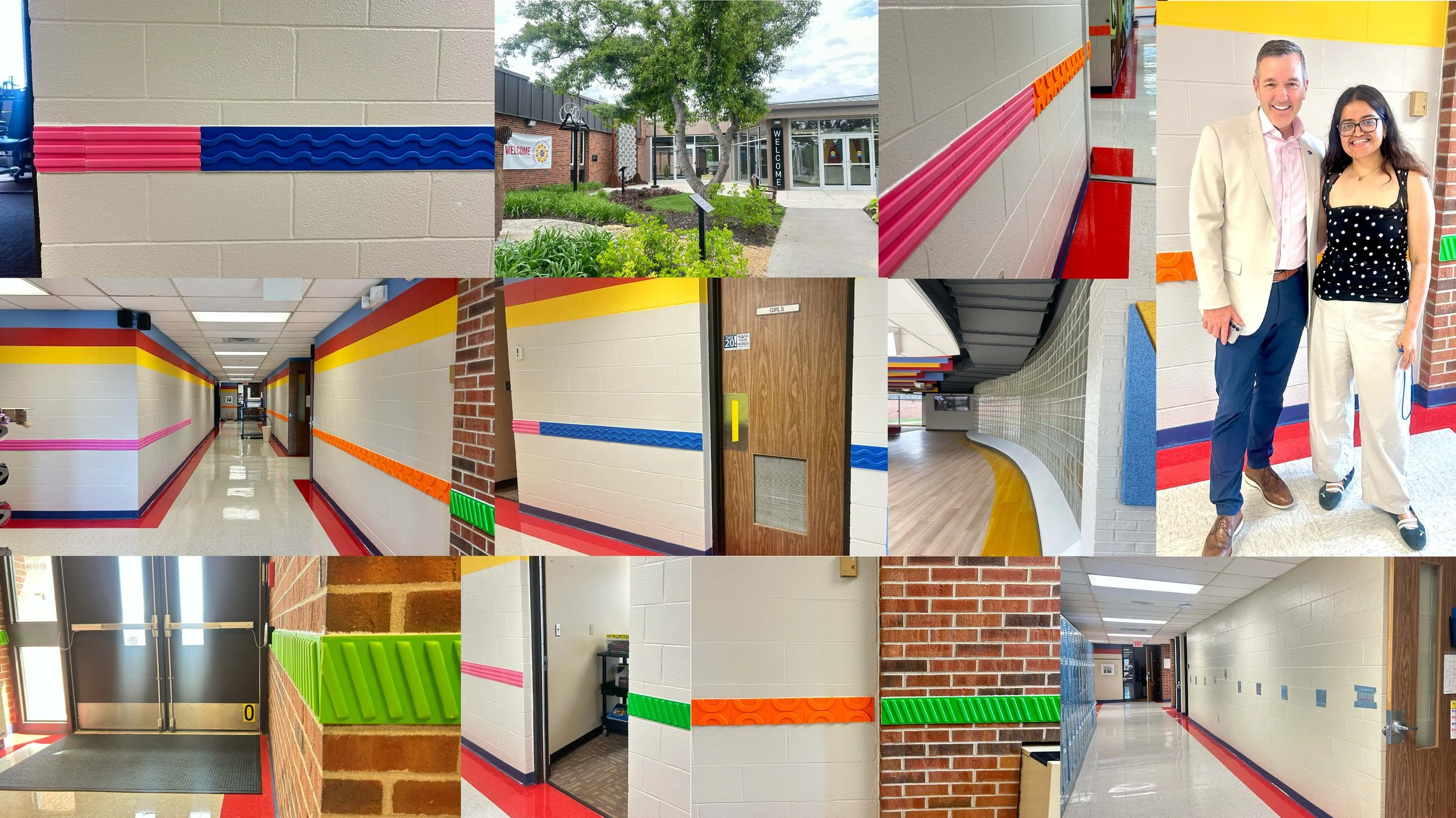
At Kansas State School for the Blind, students are taught to "find the wall."
Put a hand on it. Follow it. Use doors, lockers and water fountains as landmarks. Work out where you are, where you need to go, and how to get there.It works.But it has limits.
Open spaces can be harder to navigate. On a 10-acre campus made up of buildings that weren't originally planned as one connected site, new students and visitors can still depend on adults to find their way. KSSB's Certified Orientation and Mobility Specialists (COMS) are constantly working with students to problem-solve their routes and build independence.
And there was another problem.
The school had landmarks. It had tactile maps. It had signs and individual solutions created by staff.What it didn't have was a common language.That is what brought us to Kansas in April 2026.It also taught us something we hadn't expected: sometimes, designing a more accessible school isn't about adding more technology.
Sometimes, it's about making the building itself easier to read.
When the wall isn't enough
KSSB has been educating students who are blind and visually impaired since 1867, including students with significant vision loss and students with additional disabilities. For many, tactile information can make the difference between simply being somewhere and understanding where they are.
Jon Harding, Superintendent of Kansas State School for the Blind, told us the hardest places are the open ones. Eagle Alley, home to the school's espresso bar, can leave students turned around, because the walls, lockers and doors they rely on suddenly fall away. For new students, everything is harder still.That's why KSSB's COMS work so carefully to avoid "over-helping."Because independence isn't simply about getting from A to B.It's about giving a student enough information to work out how to get from A to B for themselves.
The problem wasn't a lack of signs
KSSB had tried. A sophisticated wayfinding system, which Jon describes as "very cool" but complex, never took off. Staff made their own signs and tactile features to solve individual problems.
Useful ideas. No system. As Jon put it:
"Our COMS often use home made signs or features, but it lacks a clear 'logic'."
That sentence stayed with us. If a pattern means "restroom" in one building, it should mean restroom in every building. A student shouldn't have to learn a new system every time they walk through a door.The building should speak one language. That became the brief: design a school that students can read.
Sensei’s two days in Kansas
In late April 2026, we traveled from London to Kansas City. From the moment we arrived, the campus felt built around one goal: helping visually impaired students gain skills for life. There's a coffee shop run by students. A makers lab with equipment that lets learners build useful, everyday products. A library stocked with every tool they need to learn. And a team that is genuinely dedicated to its students.
We spent two days walking the campus the way a student would, and listening to the people who teach orientation and mobility every day. They know what a floor plan can't tell you: which corridor causes confusion, which door is easy to miss, where a student needs a cue before a turn, and where an open space strips away the usual landmarks.
Whatever we built had to work with their teaching, not compete with it.
Five panels and a test
Before we flew home, we installed five sample panels around campus, one of each type, as landmarks. No launch. No training session. We wanted to see what happened.It didn't take long. Students started finding the panels on their own, on their way to class and to the cafeteria. And they got curious about what each one meant.That was exactly what we hoped to see. The real test was never whether an adult could explain the system. It was whether a student would discover it, wonder about it and want to learn it.
A language you read with your hands
The principle behind Sensei is simple: one pattern, one meaning, everywhere.Panels sit at the height where a trailing hand naturally falls, about 33.5 inches (85 cm) from the floor. Each pattern says one thing:
Horizontal lines (pink): the main corridor route
Slanting lines (green): emergency exit
An arch (orange): classroom door
Waves (blue): restroom
Arrows (yellow): stairs and elevators
Students with no usable vision read the texture. Students with some vision get a bold color cue too. And because the meaning never changes, a pattern learned in one building works in every other. That's what turns a set of tactile signs into a language.
Letting the experts lead
We didn't arrive with a standard layout for KSSB to approve. The school's COMS, teachers of students with visual impairments (TSVIs), principal and leadership team reviewed and tested the samples, and their input shaped the design.
Jon was clear on one more thing: consistency shouldn't cost the school its character. He wanted room for variation within the framework, and nothing "garish" that would take away from the campus. So the goal wasn't to make every wall identical. It was to make the meaning consistent.
Built for Monday morning
Accessible design also has to survive real school life. KSSB's walls are mostly brick and concrete. Tape-based solutions don't last, drilling everything isn't always possible, and the school had seen tactile items fall down or wear out. Staff also asked for soft, rounded features: nothing sharp or scratchy.
Sensei panels are made from EVA foam, tough but slightly soft, designed to absorb cane strikes rather than chip. On KSSB's brick and concrete walls, we fixed them with industrial-grade adhesive, then lined the top and bottom edges with cork so curious hands can't peel them away. They can still be removed if a panel ever needs to move.
A tactile system only works if it's still there when a student needs it.
AUGUST : PHASE ONE
In late August, just before the fall semester, we spent two days installing phase one in the Johnson Building: a continuous corridor line along key routes, plus markers at emergency exits, restrooms and key classroom doors. No renovation. Just more information added to the building that was already there.
Afterward, we walked the routes by touch, the way a student would, with Jon, the COMS team, the principal and the wider staff. We're also finishing a short training video and a KSSB-specific guide, so new staff can learn the system as people come and go.
WHAT SUCCESS LOOK LIKE
We asked Jon what success would look like. His answer wasn't about technology or panel counts:
"Features that kids and adults can recognize consistently, are durable, and can be adapted as needed to help kids feel more comfortable, safer, and can help them become more self-determined."
It's a good test for any accessible design. Does a student recognize it? Does it make sense? Is it still there six months later? Can the school adapt it? And does it give a student one more piece of information to solve a problem on their own?
WHAT’S NEXT : PHASE TWO AT KSSB
At the end of October, we head back to Kansas for phase two: the Vogel Building and the cafeteria. That means staircases, more corridors, exits, restrooms and classrooms, and the cafeteria entrance, one of the places students most want to reach on their own. We'll share what we learn.
KSSB is our first school in the United States. We can't wait to see where the lessons from Kansas take us next.